Tuesday, 30 November 2010

Digipaks...

This is the first draft of the plan for our digipak, we thought that most of our panels should have a picture of our artist on, this is because we think that she should be our main focus. But with more discussion we thought that maybe on two of the panels we would just have a picture without the artist on it or some of the lyrics bleeding across the page. I am doing one of the middle panels and the panel where the CD is, Jil is doing the other middle panel and front cover whilst Jess will be doing the back and an inside cover.
For my middle panel I am creating a quirky background with a picture of the artist on it and for the panel that holds the CD i have decided to create a background on Photoshop or InDesign and use that for the panel. 


Sunday, 28 November 2010

Shot List...

For the shoot where we film the narrative side of the story we thought it would be better to have a shot list so that we were more organised and could film to plan and to what we wanted.

  • Long shot of girl walking up the street
  • Medium shot of someone posting something through the door
  • Medium shot of her walking through the door
  • Close up of her looking at the invitation
  • Medium shot/ Close up of her throwing it on the floor
  • Medium long shot of her walking up the stairs
  • Medium close up of her looking in the mirror
  • Close up and medium shot of her looking in the mirror admiring herself
  • Medium long shot coming down the stairs
  • Long shot of her walking down the street

This is a basic shot list that we will be changing and also following to an extent when we are filming. We may choose to change some of the shots to ensure that we have a variety of different shot types. 

Saturday, 27 November 2010

Changes in Filming...

Whilst we were editing our first video shoot we realised that we had made a mistake by filming in widescreen. By doing this it left a black gap at the top and the bottom of the screen. This meant that we were not following the framing world, so having talked about how we were going to rectify this, we decided that we were going to re-film this part of our video. We have decided to do this for continuity reasons and so that our video is consistent throughout. We have planned to film on Sunday the 28th of November in Jil's house where the original video was filmed. We also realised that in the first clip of filming we did the camera was not positioned properly so we cut part of the protagonists head off, we realised that this was acceptable if we were doing a close up, but as the shot was not a close up it was not professional of us to chop the top of her head off. So by filming again we will be able to perfect the shots and shoot it in normal screen rather than widescreen. 

Thursday, 25 November 2010

ColourPalettes....

For our video we needed to decide on colours that would be appropriate with our video and that would give our artist originality. I have used the website http://www.colourlovers.com/ to look at different colour palettes which we could use in our video. I have seen these three which i think would work well for our artist and the image we were trying to get across.


Milion_poljubaca
Color by COLOURlovers

emmy_dear
Color by COLOURlovers

Paleta_Elena_2
Color by COLOURlovers

In my opinion i believe that the first colour palette would suit our album the best.
I also asked five other people 3 of whom said the first one and 1 person liked each other the palettes.
The 3 who said that they like the first one said....
"there is a wider range of colours which would look well" and "the colours are nice and they look natural like palette 3"

Changes in Narrative...

We have decided that we were not going to use Fran in our narrative part of our music video, Fran played the character of the protagonists sister. We decided that we did not need her within our film because we changed the narrative slightly and also it was hard to get hold of Fran due to her being busy and she wasn't available when we needed to film. So instead of using her we just used the protagonist throughout our music video. 

Tuesday, 23 November 2010

Location....


This is the first video that we shot of our location. We chose to use the woodlands and falling leaves because it looked quite natural and we thought that it would be good to use when we had filmed our artist in front of the green screen. We also think that because our song is called this little bird the background would be suitable. Also as I mentioned in another post I was inspired from the Nelly Furtado video where she was led on grass singing. 
When we first shot this video it was 7 minutes long and by using final cut express I cut it down and made it to 1 minute as we thought that 7 minutes of the same footage would not be needed. Also after quite a lot of effort to upload the video as I had some technical difficulties, I uploaded it to youtube and then embedded it onto Blogger. 

Monday, 22 November 2010

Final Font for Digipak cover

After deciding that the last two previously shown fonts where ideal for what we wanted, we tried to find different ways we could include both these ideas for 'Allison Crowe- this little bird'. With the use of different Photoshop brushes for our final font, the following was achieved: 
We think that this text is most suitable for our artist because we also intend to use this text on our magazine advert as this will begin to create a logo and iconography recognised by our target audience. To make sure, we asked females aged 15-20 year olds. Below are some of the comments made:
'The bird at the end is so cute!'
'it looks like it's a folk singer.. am I right?!' (yeah, you totally are!!)
'I like how it looks like the artist wrote it, it's like an autograph'


Initial Font Ideas.

We have been thinking and researching ideas for our digipak and are focusing on ideas such as colour, font and images. We have example of some fonts which we are considering to use. There are many different varieties of fonts and styles. We wanted a font that stood out, was bold and quirky all in one. As you can see some of these fonts are bold yet many are thin. Some also come with little quirky styles such as the love heart on the 'i' and the flower at the end of allison crowe. Many of these fonts are also as if handwritten style so it gives it a more personality.


When looking through the fonts we thought about how it should look on the album. We then decided we want to combine these two fonts together. So for example using the A and C on the first font below and then using the second font writing for the rest of the name. We also like the idea of a love heart on the 'I' so we plan to replace it with a bird as the song is called 'this little bird'.

Saturday, 20 November 2010

Raw Shots for Ancillary Task!

Here are raw shots of our artist. We will be editing and using these images for our ancillary tasks: both digipak and magazine advert. During this session, Polly chose what lighting suited Heather the best in the most flattering way, Jess was in charge of throwing leaves over heather (it didn't work) as well as using the gold and white reflector... and I took the pictures whilst giving heather some direction of the way we want her to look (:


Friday, 19 November 2010

Bad Chroma Key?

As a media student, I have become analytical and some what cynical towards media texts.
I was just flicking through music channels for inspiration and I came across Check it Out by Nicki Minaj, Will.I.Am and Cheryl Cole. Generally the editing of the video is really good.. apart from the chroma key sets of Cheryl Cole.
(Below are some screenshots of what I think is bad chroma key) As you can see their is a slight halo around her body, especially seen around her hair. To minimise the halo.. the enhance tab just needs to be adjusted slightly to create a purple outline. This would be really effective as Cheryl Cole has red hair, therefore the purple outline would be interpreted as highlights.

I guess professionals get it wrong too!


Monday, 15 November 2010

DigiPaks Research.


A digipak is a style of CD styled packaging. The packaging is made of card instead of plastic and can hold more than one CD. This is part of our ancillary task, to create a digipak. One example of a digipak is Green Day's greatest hits album.


As you can see Green Day have remained with the colour that is in their name, green. Also Green Days first branding image were the colours black and green. As this is the greatest album, it sticks with the bands original brand image and the fans immediately now which band they are. Images of the band are behind the CD's in green and white to make them stand out and make the image more bold and noticeable. 

Digipaks research...

The basic definition of a Digipak is: a patented style of compact disc or DVD packaging, and is a registered trademark of AGI Media, a MeadWestvaco, Inc.resource, which acquired the original trademark holder, IMPAC Group, Inc., in 2000. MeadWestvaco licensed the name and designs to manufacturers around the world.


I have been looking at examples of digipaks which are from artists that are quite popular within todays society. As you can see most of the digipaks I have posted are based on the artist. Most of the pages of the digipak are photos of either the band or the artist. This is because it shows how the artists want to be presented and it also shows their style. It gives the audience an insight into what the artist is like, it also gives an insight on what the music on the album is like. For example on Katy Perry's digipak she is dressed quite fun and quirky which is also what her music is like. If you listen to the album then her music seems quite fun which is represented on the album cover. 
There are also some other examples shown here of other bands and artists.


Katy Perry's Digipak shows her in different costumes which shows her quirky style. Her pictures are also fun which is the same as her music. The colours that she has used are quite bright and colourful which would make the album stand out. 


This is the N-Dubz album cover and CD and they are dressed in the same outfit. The clothes that they are wearing show their style and what their music is like. The clothes they are wearing are typically Hip-Hop clothes which is the kind of music that they sing. 


Here are two templates of Digipaks that we could use. There is a four paned one and and six paned one. We think that we are going to use the six paned one, as this will give us a bigger chance to show what our music is like and to be able to show the style of our artist. We will have pictures of the artist on most of the panes. For the front pane we will have a very strong picture of our artist that shows the audience our brand identity, also the detail must be good because we want audiences to relate with it and be able to identify with it and make it rememberable. The back pane will have the list of tracks that are on the album and it will also have publishing information and distributors. This is because the audience may want to know what company our artist represents and this could also lead the audience into listening to other music which is used in the same company. 

Feedback 15.11.10

Girls, You have done nothing over the weekend - you need to work on this in your ow time to meet the xmas deadline. Hopefully, you'll be filming this week and therefore have footage to edit in lessons. However, if not, then you should complete the research and planning for the ancillary tasks. You will each have to split your time on the video and print tasks equally over the next five weeks to get them all complete by xmas.

I'm not in tomorrow (tues)but the lesson will beheld as normal. Mike will let you in and be on hand if you need anything.

Mrs A

Lighting Techiques + Training!

To ensure that our images for our ancillary tasks are effective and professioal. We had a training session in the media suite for lighting and how to postion them when trying to create different moods.
Below are examples of techniques we learnt.


Rembrandt
With one of the light sources, (in our case a soft box) moved higher and further to the left, it creates a deep shadow on one side of the face. amed after a Dutch painter, Rembrandt lighting can be used to create the mood of intensity and mystery when having a character as villian or a muscian in the rock genre. However, in our case to brighten the mood, we also added a gold reflector to soften up the models features and creating an even skin tone.
In our image, we wanted to soften the shadows on her face to create a more fresh, innocent look; we did this by using a white reflector - this bounces light onto the models face that reduces the harsh shadows that may be cast.

Butterfly
Although our model is looking away, here is the 'Butterfly' technique also known as Paramount (this is noticed by the symmetrical shadow of the model on the white background) By placing one of our soft boxes behind the other and above the model, it creates a butterfly shape under the nose. This technique is best suited for our artist because it is most common in beauty shots and highlights the cheekbones.


Digipaks

As part of our coursework, we also have a set of ancillary tasks to support and market our artist. One will be a dipipak: an alternative to the common jewel case, it is a book style made out of cardboard that has one or more CD's attached on the inside.
This packaging will be beneficial to us and the creating of our artist because digipaks ae usually used for CD singles or special edition albums. Therefore, to establish our artist into the music industry, it is in our best interest to produce a digipak.
Although not as robust as a jewel case, digipaks seem to create a mood and story about the artist before they have even listened to the song because it povides the consumer with a series of images that creates a sense of relationship with the artist.


Here is an example of a digipak by established singer Beyonce Knowles. As a special edition album consiting of all her best songs, her digipak includes images of those songs/albums. As an R'n'B singer, conventions of that genre differ to ours; yet they are similar in the essence of creating a relationship with the consumer. An example of this is the direct address Beyonce carries in the left image, her target audience of 18-35 females will appreciate the warm, inviting feeling; whereas her body language and costume gives the message of sexiness that relates well to the genre and will be appreciated by her secondary audience of 18-35 males. 


In Phil Collins digipak, I'm really inspired by his image concepts and minimal colour palette. The cropping of the other half of his face can be interpreted in different ways to appeal to his audience. One could be that through Phil Collins songs, the other side of his 'face' will be revealed, creating a relatioship between the artist and the listener. In addition, an image of him at a youger age on his front cover is rather intimate, this is effective because it suggests a warm welcome Phil Collins' album has to the audience: suggesting he is willing to tell his life story through his songs.

Wednesday, 10 November 2010

Risk assessment form

Before we went out to shoot on location we had to fill out a risk assesment form, signed by us and our teacher to check the types of risks that may occur whilst filming at Corporation Park.


Tuesday, 9 November 2010

Filming Schedules!

As busy individuals with responsibilites in and outside college, we have struggled with our film scheduling and when we can all meet up as a group. Therefore, we have all split our time accordingly.

Me - Friday 12th November 4.30 - late. I will be filming 'Transformed Girl' and her sister my house. As a team, we have already discussed how we want to film this segment. On the other Hand, I will be setting up and filming alone because of other arrangments Jess and Polly have that day. They will still be at the recieving end of the phone line when I need help.

Jess - On Thursday 25th 2.30 - 4.00, Jess will be making sure that all props and costumes are ready for Friday when filming Heather. In addition, she is the director for the Chroma Key segment with Heather. As a team, Polly and I will set up the lighting and do Heathers make up and costumes.

Polly - She is in charge of filming the Chroma Key background, on Wednesday 9th November we are all going to Corporation Park. Jess and I will ensure that we use the leaf blower effectively where Polly will select the best location for our background.

So far, we have shared out research, planning and filming equally to make sure that each member is doing their part.

For Post production and editing, we will be working in and out of college time. Polly will monitor editing the colour and saturation in Chroma Key, Jessica will ensure if all camera angles have been included and I will make sure we have well thought out transitions and effects

Chroma Key!

Our chroma key tutorial consisted of us learning ow to light the green screen accurately and making sure we filmed our model (Jil) effectively by keeping the camera still.

Editing in Final Cut Express enabled us to select a background and amend the colour saturation etc.

Monday, 8 November 2010

Feedback 8.11.10

Well done girls. You have been working harder on this over the last week. You still have plenty to catch up on though. By now the research and planning should be complete. You need the next 6 weeks to produce your video and ancillaries.

Firstly, label your posts with your name or I will not know who to reward when it comes to marking. Also, I cannot find any results to your questionnaires. You need to present the data as charts, graphs etc and analyse the findings. What have you learnt about your audience? Identify them using theory and discuss any ideas that they have given you!

Planning - there is no evidence of this as yet! I need to see a storyboard. I know you have done one. Upload it - even if you are changing it. These changes are part of the planningprocess sp show how your thoughts and plans are developing. Also, upload some casting and location shots, shot lists etc. If there are any videos that are inspiring you (eg, those you were showing me the other day) then ensure you upload them and discuss them. Keep blogging - take turns to type up the minutes of any prodcutions meetings and discussion you are having as a group.

Try also to plan out the still images you may need for the ancillaries - this will save you time in the long run. Get studios and any other locations and personnel booked asap.

See me if you need further advice.

Mrs Abell

Sunday, 7 November 2010

Inspiration + Intertexuality!

To film and edit a successful music video we have been looking at current music videos that have inspired us to adapt some of their features and present intertextuality that can be used as a reference to TV, film and music texts.

Christina Aguilera - Beautiful
Similar to our target audience of young people who may have insercurities, Christina Aguilera uses empathy and emotion to convey the message of beauty and being comfortable in your own skin. An Example of this is the long shot of the thin girl looking in the mirror and being unhappy with the way she looks. Towards the end smashing the mirror and smiling, in a medium close up suggesting that she is beautiful and she should be happy with the way she looks. This paticular character has inspired us to use the same technique of low-key lighting of presenting a melancholy mood and then altering to a cheerful mood by using high-key lighting. Intertexuality is the relationship and referencing of other media texts. Therefore, if our target audience think that our music video refers back to this one, it has success because being related to a music video that also has the same target audience to yours, can show that our music video is appelaing to the correct audience.


Inspiration and Intertextuality...

Nelly Furtado- I'm Like A Bird!

To create a successful music video which will entice audiences and be popular I have been looking at other music videos which are quite popular for inspiration. I chose to look at I'm Like A Bird by Nelly Furtado, I looked at this because it had quite a wide ranged audience and it was quite a popular song and music video. The target audience for this music video is similar to the target audience that we are aiming for. This is another reason i looked for inspiration because if it was a popular video then maybe by using some inspiration our music video may be as popular. The inspiration I took from this video was the chroma key background. Throughout the video Nelly is in the woods or a forest. I thought this looked quite original also it was a basic setting which means that you can concentrate on your artist and other aspects of your video.


Chroma Key, Inspiration and intertextuality.

To create a successful music video we have be looking at different various music videos for inspiration so we can create a music video that is popular to audiences.

Madonna - American Life
In this simple video, we see Madonna in front of many different images of flags from around the world. This has been done by using chroma key. They have put Madonna in front of a green screen and as she is stood in front performing, they film her and lace images of the flags behind her in editing. Which is a idea we want to use in our music video, with our performer in front of a green screen and later in editing, we have a filmed seen behind her. Also the editing of Madonna is another inspirational idea. Quick close ups and editing of Madonna reappearing in front of the flags.

Saturday, 6 November 2010

Casting!

Since Web 2.0, interactivity has given us the chance to communicate with peers easier. Therefore, for casting images instead of snapping polaroid images of potential characters (possibly in their worst state), I have decided to take two of their best images from their Facebook account, obviously with their consent. Below are the characters and why they are suitable for the part.

Heather - as Allison Crowe
  A versatile individual who can rock anything, from platinum blonde to vivid red hair. Her basic instinct to step outside the fashion basic immediately links to the iconography of our artist.   


Sadie - as 'transformed' girl

Evidentally, this individual has stunning features and emphasised with a soft-key lighting her beauty will be enhanced. On the other hand, using low-key lighting or simply whipping her make-up off, her look can change dramatically - this will be helpful in our music video when 'transforming girl' has a low self-esteem based on her looks.


Location Shots

For our music video we need various different locations. We wanted locations such as a park with plently of fallen leaves, a bedroom for our girl in the video and a house as well.
For our park location we are planning to film our Chroma Key background in Corporation Park, this is because there are plently of trees with many fallen leaves that we plan to throw in the air. As well on a sunny day we can get plently of beautiful imagery. We want the idea of autumn and leaves falling from the trees. Above, is the image of the location in Corportation Park we plan to film. 


For our house and bedroom shots, We plan to use Jil's house to film these shots. We will use her staircase, to show her sister giving her the bag with the dress in and the girl refusing to take it. We will also use her front door to show an invitation being posted through the door. As well as this, we are using Jil's bedroom as the girl's bedroom to show her when she is upset over having no confidence and pulling the dress out of the bag. We want to use Jil's bedroom because it is a nice vibrant colour, as well as a long floor length mirror so our actress can show her confidence as well as her shy image in front of the mirror.

Another location we will be using is the Media room, were we will be using the green screen and white screen for photography shots. Here we can film and take photgraphs of our singer performing and posing in front og the camera. This will be a great location because we have the right lighting and technology so we can create a outstanding music video.

Prop list and Costume!

In Mise-en-scene. props and costumes play a significant part of being able to recognise the genre and narrative of a media text.
For our pop-folf music video, here are the props we are using:

Leaf Blower - for the chroma key background, we need leaves blowing around for the Autumn feel
Party Invitation - for the music video to have a narrative. 'Transformed Girl' has been invited to a party
Box - this will build up some suspense of it's contents.
Make up - viewer will see older sister applying make up on 'Transformed Girl'
Mirror - for the camera to capture a scene of her looking into the mirror
Red Dress - for the 'Transformed Girl' to wear towards the end of the music video
Black Boots - these will be worn by the 'Transformed Girl' at the beginning and the end of the music video
Hat and Coat - this will be worn by the 'Transformed Girl' at the start of the music video

Friday, 5 November 2010

Costume inspiration...

We want to dress the artists according to their personality and the genre of the song. We also want to dress the actors in our movie video using up-to-date clothing which could inspire a wider audience because they like the style of the band. We have looked at inspiration from other artists that wear up-to-date clothing and other people who are in the media, that young people like because of the way they dress and act.


This picture of Fearne Cotton shows that she has a quirky style and that she is individual and wears clothes that are stylish. She is also looked up to by many young people so by mimicking or taking inspiration from her style we may be able to create a music video for a wider audience. 
Paloma Faith is a popular artist who is quite popular with the younger generation of about 18-25. She is also famous for her quirky unusual dress sense. We like Paloma's style because it is individual to her and she doesn't "follow the crowd" and she wants to stand out. We would like our artist to stand out so that our music video and music is remerable.

This image of Eliza Doolittle shows that she wants her image to stand out by using bright colours and individual images. This is what we want for our artist so that the image and brand is individual and something that the audience will remember and enjoy. She also has a quirky, individual style and her clothes are also quite up-to-date and stylish which is what we are aiming for. 


Rihanna who is one of the most recognised artists by young people today has her own style but she also diverges to clothing and image that she knows people will like. In this picture her clothing is quite casual but it would also appeal to people. Her hair is the main part of her image because it always stands out and she has her own image and changes it a lot but audiences always remember her by her stylish clothes and quirky hairstyles. 

Polly

Wednesday, 3 November 2010

Synopsis

To relate to our target audience, our aim is to use empathy throughout our music video. Therefore, our music video will be based on a shy girl, known as who initially doesn't have a 'personal identity' - she has low self esteem and shows this by her body langauage of looking down on the ground as she walks, lack of eye contact and clothing eg, baggy clothing, dark colours and untamed hair. The video begins with looking at a party invitation as she walks to her front door, she scrunches it up and places it in her pocket. As she enters, she is welcomed by her sister: a tall, beautiful and cheery individual who has confidence, this is shown by her upright posture, eye contact and sense of style eg, bright colours, dresses and ballerina pumps. As her sister approaches her, she gives her shy sibling a box she looks into it and is displeased. As she walks into the living room and followed by her confident sister, the have a confrontation about 'the right way to look'. Fustrated, she runs upstairs into her bedroom and bangs the door shut. With the box thrown onto the ground, the shy girl crouches in a cornor staring at the party invitation.

As she looks back up with tears in her eyes, she begins to look around in her bedroom: dark, rugged and bland - similar to her. She gets up and begins to face the mirror. Unhappy, she looks back at the box, picks it up and takes a red dress out. As she presses the dress against her body, a vague smile appears on her face. She begins to take out the rest of the contents in the box: make up.

Her sister walks in an looks at her holding the contents, she looks and smiles. sat on the floor together laughing, the confident sister helps her apply the make up.
The shy girl looks in the mirror, just before her sister leaves the room, says 'You look beautiful', with a smile she continues to get ready.

Walking down the stairs, she has transformed! With her sister waiting for her at the bottom of the stairs she hands to her a pair of black boots that belong to her sister, she says 'Go on!'

The music video ends with her walking down the road in a red dress and black boots.

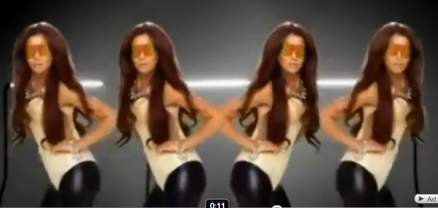
During this music video we will also be referring back to Heather, who plays Allison Crowe to ensure viewers know the artist singing. She will be set infront of Chrome Key playing the keyboard and singing the song.

Tuesday, 2 November 2010

Equipment and Technology


A hand held camera to capture our footage. We will also be using tripods to have a steady base when filming shots.
Chroma Key allows us to experiment with different backgrounds by lighting the figures and screen seperately and then. This will give our music video a professional, polished effect.
A digital camera to capture still images of location shots, casting calls, magazine front cover and DigiPak.
Using Final Cut Express to edit and produce our final music video. By using various transitions and effects, we wll be able to make our music video look pofessional.
Using Photoshop to edit our images from the contrast of our digipak images to the Masthead of our magazine front cover.
Using InDesign to create a magazine front cover layout and ensure it looks professional.

In addition, we have also used websites such as Jamendo, Google and YouTube for research and planning.

Jess + Jil